The Visual History of World Poverty
Teaching Notes from Our World in Data
About these Teaching Notes These teaching notes are part of a series of resources from Our World in Data.They have been designed to support those interested in teaching and learning about global development, and they require no background knowledge. Here we touch on the following questions: What is extreme poverty?Why should we care about it?How should we tackle it? For more teaching material visit: ourworldindata.org/teaching-notes
Outline
- Millions of people live in extreme poverty: Who are they?
- We can reduce poverty
- We should reduce poverty
- How can we reduce poverty?
According to the International Poverty Line, people are considered to be in 'extreme poverty' if they live on less than $1.90 per day, or the equivalent amount after converting currencies and adjusting for price differences between countries. This is the definition used by the World Bank and many other international institutions.
About 700 million people in the world live below this low threshold. And about 4.7 billion people (more than half of the global population) live on less than 10 dollars per day. (Note: In this interactive chart you can click on the option "Change country" to plot numbers for any country or world region.)
People living in extreme poverty are concentrated in certain regions. The country where you happen to be born makes a huge difference to your expected living standards. (Note: In this interactive map you can use the slider at the bottom to show estimates for any year.)
If we focus on the intensity of poverty, we see a similar pattern: The countries where a large share of people live in extreme poverty are also the countries where people tend to have the largest shortfall from the poverty line (i.e. the 'poverty gap' is largest in these countries). In other words: People below the International Poverty Line tend to have much worse living standards in low-income countries. (Note: In our map charts you can click on any country to display the time-series estimates in a line chart.)
Outline
- Millions of people live in extreme poverty
- We can reduce poverty
- We should reduce poverty
- How can we reduce poverty?
It's important to remember that despite the magnitude of the challenge, poverty is not unavoidable
In 1820 there were just under 1.1 billion people in the world, of which more than 1 billion lived in extreme poverty. Over the next 150 years, the decline of poverty was not fast enough to offset the very rapid rise of the world population, so the number of non-poor and poor people increased. Since around 1970, however, we are living in a world in which the number of people who are not living in extreme poverty is rising, while the number of people who are living in extreme poverty is falling. (Note: You can read more about this in our article discussing extreme poverty in a historical perspective.)
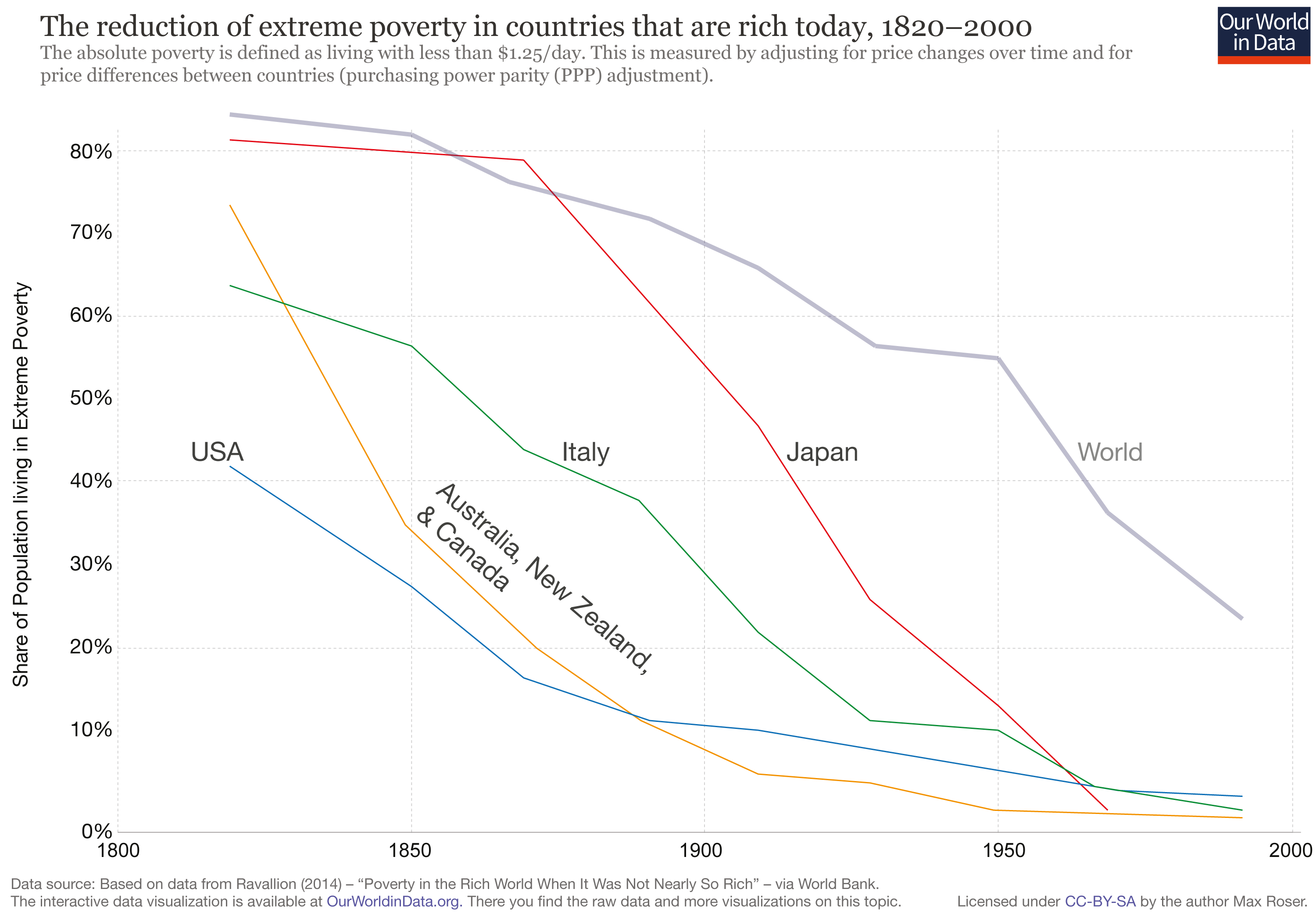
In fact, in today's rich countries a large share of the population lived in extreme poverty until fairly recently. Actually, in most of these countries the majority of the population lived in extreme deprivation only a few generations ago. Progress was made at a fast pace — in some cases even at a constant pace.
And this progress is not only about incomes moving marginally above the extreme poverty line. In recent decades the global poverty rate has been going down independently of whether we set the poverty line at 1.90 or 10 dollars per day. (Note: You can read more about this in our blog post "Extreme poverty is falling: How is poverty changing for higher poverty lines?")
The experience of China is remarkable in this respect. In 1984 more than two-thirds of the population lived in extreme poverty; and over the course of just one generation the share in extreme poverty declined to less than 2%. (Note: You can explore trends by country using the option "Change country" in this interactive chart; and you can also toggle the option "Relative" to show total poverty headcount figures.)
Outline
- Millions of people live in extreme poverty
- We can reduce poverty
- We should reduce poverty
- How can we reduce poverty?
There is no empirical evidence to support the romantic idea that people living in extreme material deprivation are satisfied with their standards of living
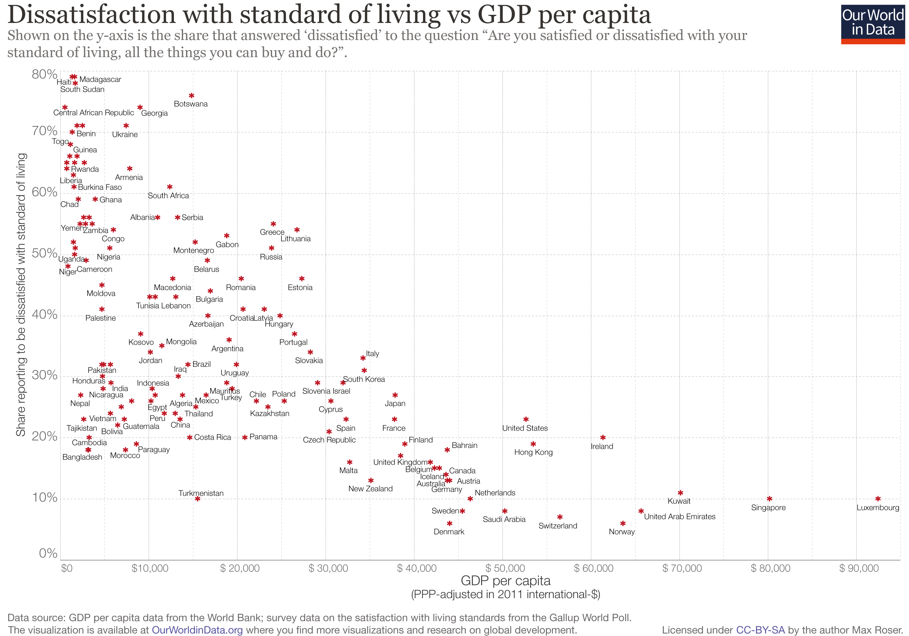
The Gallup World Poll asked people around the world what they thought about their standard of living—not only about their income. The following chart compares the answers of people in different countries with the average income in those countries. It shows that, broadly speaking, people living in poorer countries tend to be less satisfied with their living standards.
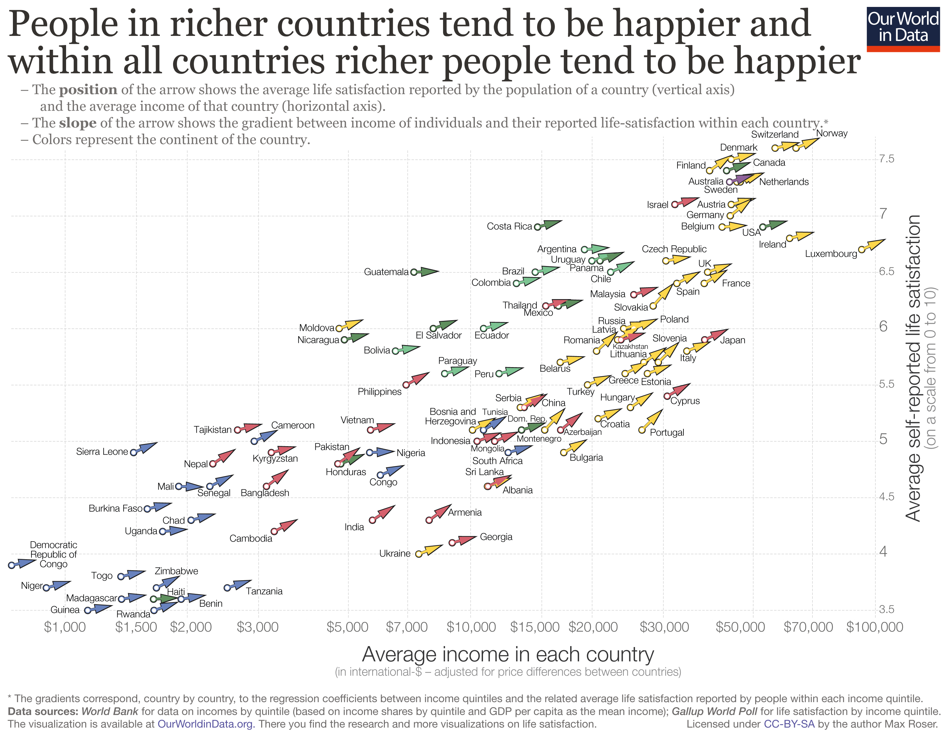
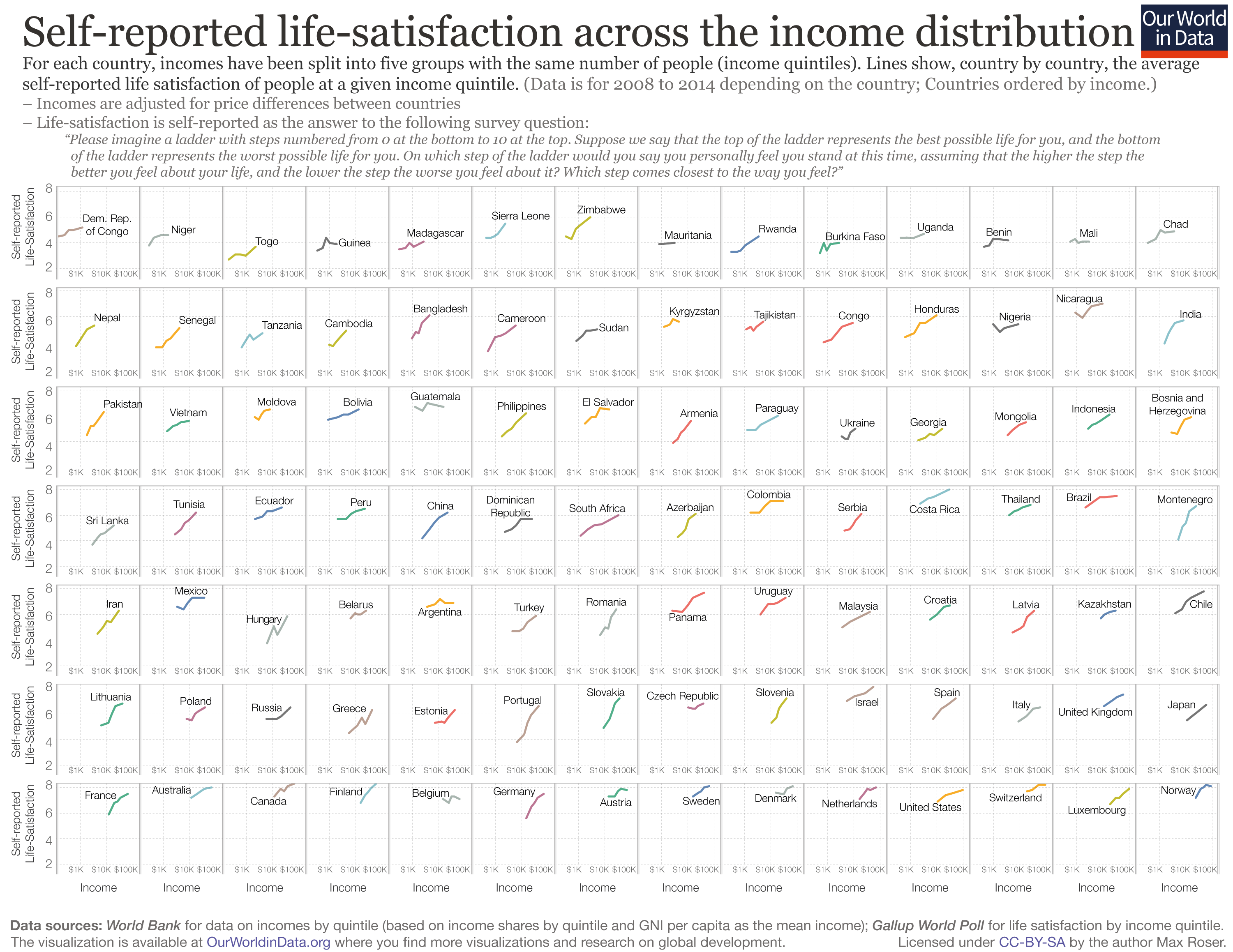
And there is a similar correlation in terms of subjective well-being. As this chart shows, low-income countries tend to have lower self-reported life satisfaction; and richer people within these countries tend to have higher self-reported life satisfaction.
Outline
- Millions of people live in extreme poverty
- We can reduce poverty
- We should reduce poverty
- How can we reduce poverty?
Poverty is complex. It's not just about monetary incomes.This chart shows a proxy of 'multidimensional poverty' weighing ten household-level indicators of deprivation in the context of education, health and living standards. As we can see, monetary and multidimensional poverty are related, but clearly not one and the same. (Note: You can read more about this in our article discussing poverty across multiple dimensions.)
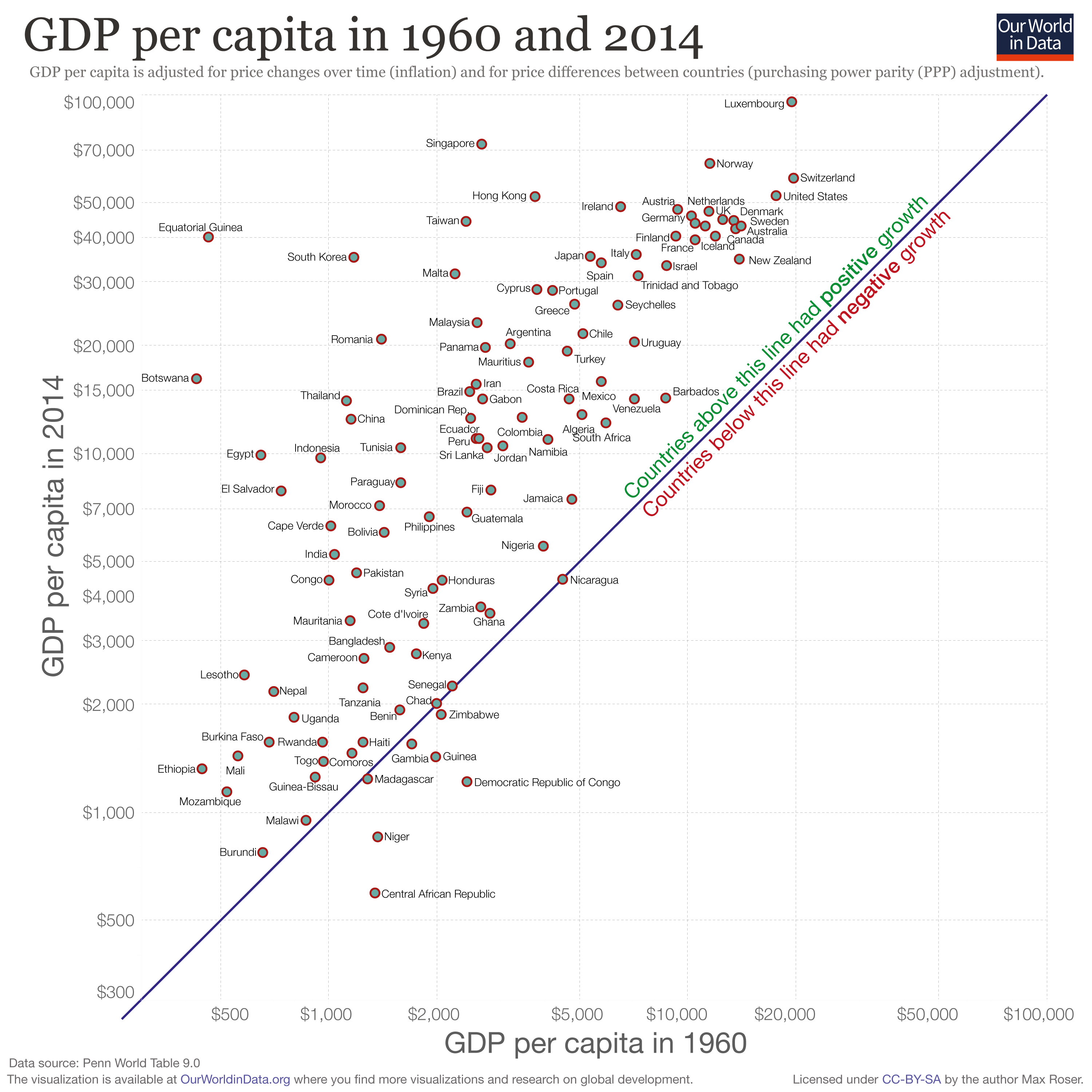
But higher incomes do make a huge difference to living standards. It's no coincidence that in the last decades, when we have reduced poverty globally, we have also witnessed important economic growth.
Indeed, the correlation between GDP per capita and extreme poverty is strong, both across countries at any point in time, as well as within countries across time. Note: This 'connected scatter plot' shows country-level changes in GDP per head and poverty rates over time; specifically, over the period specified in the slider. You can move the marks on the slider to change the length of the time window for which changes are plotted. When the beginning and end marks coincide, the chart plots a traditional cross-sectional scatter plot.
Social policy and direct household-level support, too, make an important difference.
Social policy is important both because it can contribute to promote income growth, and because it often makes the wait for growth less painful.
“Economists (and other experts) seem to have very little useful to say about why some countries grow and others do not... Given that economic growth requires manpower and brainpower, it seems plausible, however, that whenever that spark occurs, it is more likely to catch fire if women and men are properly educated, well fed, and healthy, and if citizens feel secure and confident enough to invest in their children, and to let them leave home to get the new jobs in the city. It is also probably true that until that happens, something needs to be done to make that wait for the spark more bearable.”
(Banerjee and Duflo, Poor Economics, Page 270)
Further Resources from Our World in Data
- Blog posts and data entries on this topic: – ourworldindata.org/extreme-poverty – ourworldindata.org/happiness-and-life-satisfaction
- Teaching Notes for other topics: ourworldindata.org/teaching-notes
About the author: Esteban Ortiz-Ospina is an economist at the University of Oxford. He is a Senior Researcher at the Oxford Martin Programme on Global Development. About Our World in Data:Our World in Data is an online publication that shows how living conditions are changing. The aim is to give a global overview and to show changes over the very long run, so that we can see where we are coming from, where we are today, and what is possible for the future. www.ourworldindata.org | @eortizospina